
- ←
- Back
Bisleri Mobile App : A design-driven approach to a successful bottled water delivery app
About Bisleri
Bisleri is the most trusted mineral water brand in India for decades. Having a strong presence with 126 operational plants and a strong distribution network of 4500 Distributors & 5000 Distribution trucks across India. Bisleri has recently started their online water delivery service, wherein you can place your order through the app and receive water hassle free.
Agency
PivotRoots
Role & Responsibility
Visual Design, Interaction Design
Tools Used


Year
2021
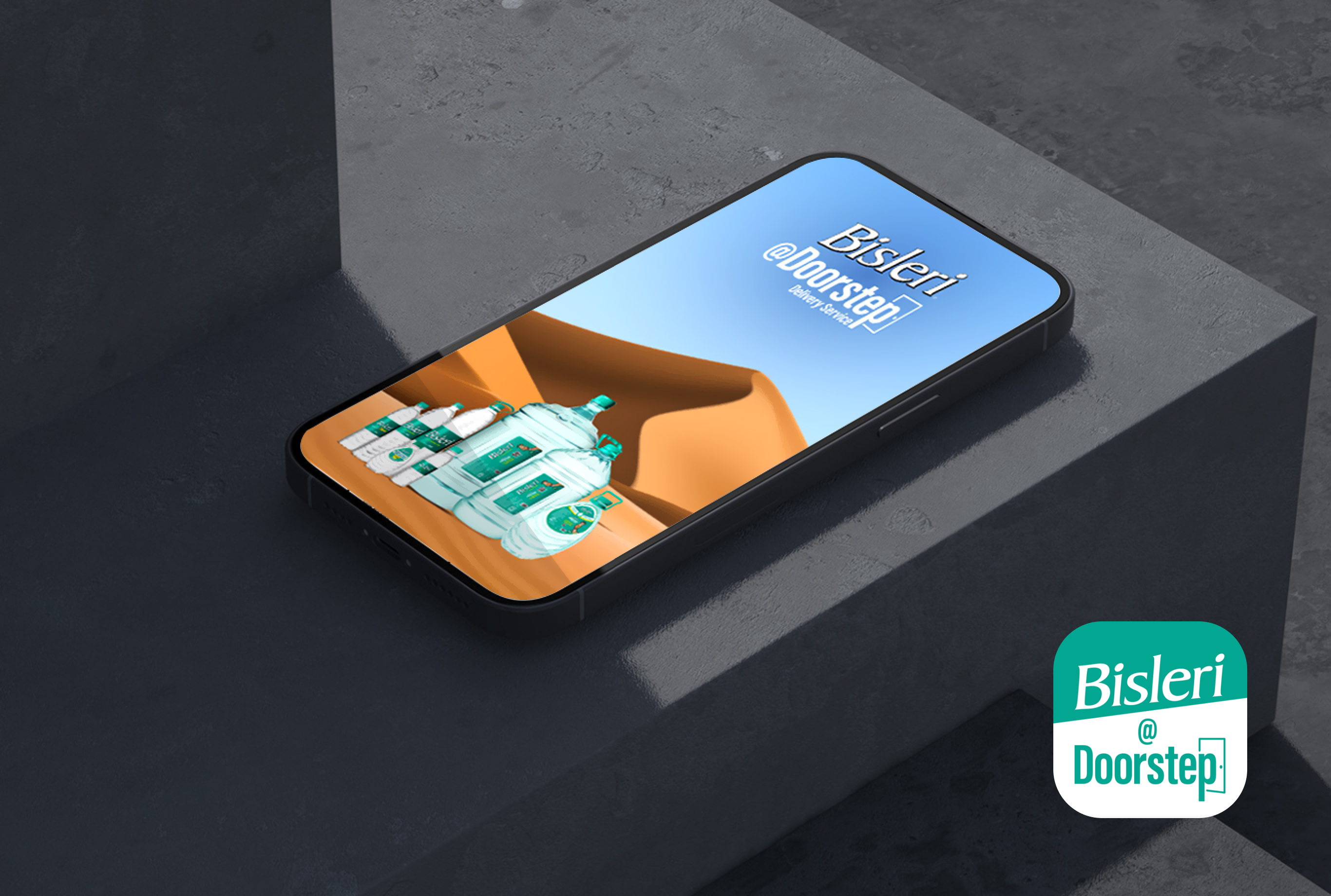
Brief
The core idea was to create a mobile app that seamlessly reflected Bisleri's brand identity of purity, refreshment, and naturality. To establish a design that not only portrayed the brand's identity but also provided a seamless and enjoyable user experience.
Responsibilities
With finalized wireframes in hand, I began the visual design phase for both Retail and distributor app. Our design focus was on creating minimalistic and visually appealing interfaces aligned with the brand identity and user preferences, prioritizing clarity and avoiding clutter.
- Our primary focus on UI design decisions : Layout, Typography, Colour Palette, Visual Elements
- Interaction Design : Micro Interactions, Transitions
- Prototyping
- Usability Testing
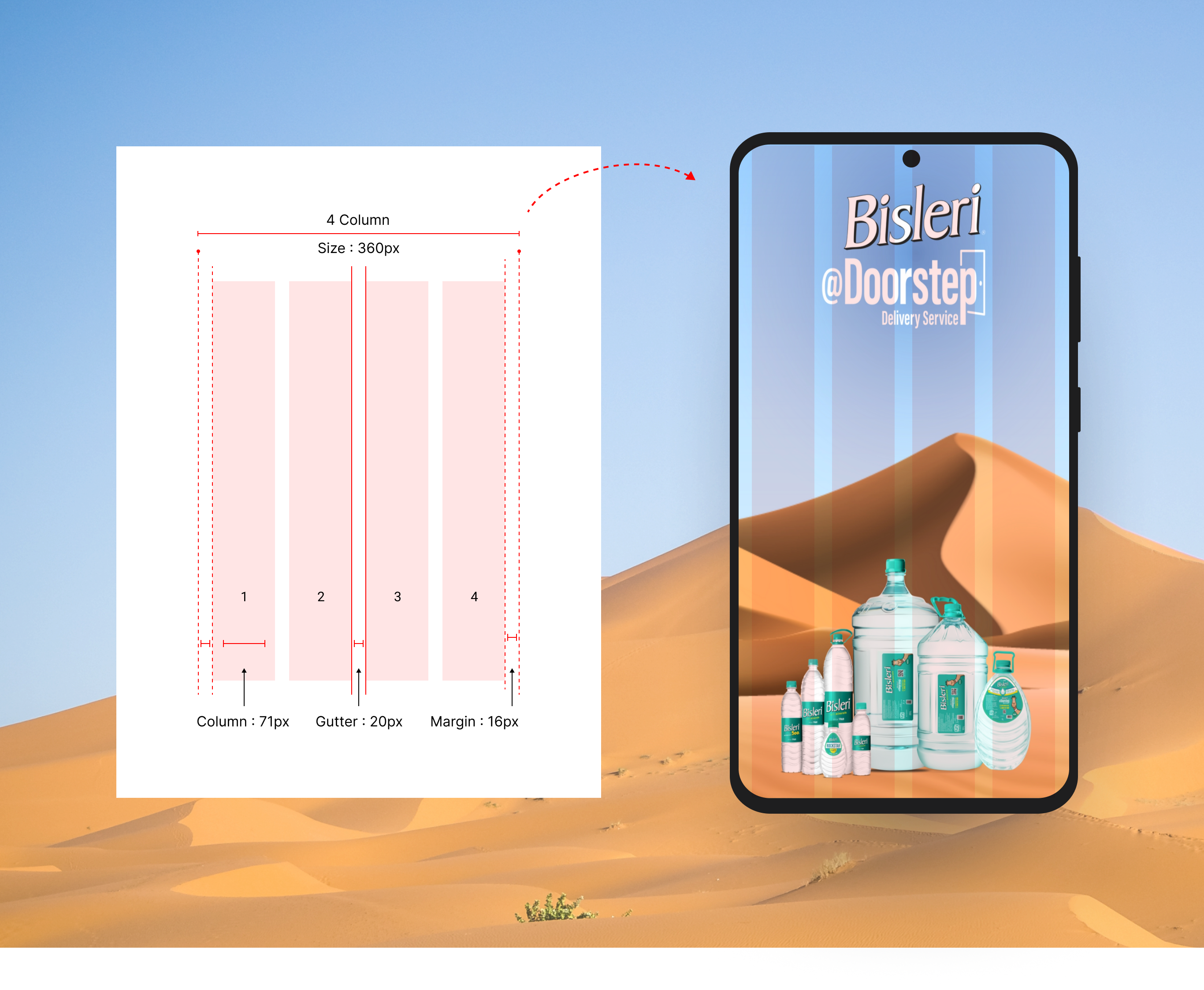
Grid Layout
We solved the challenge of designing interfaces to be organized, balanced, and user-friendly. By using column grids, we guarantee seamless navigation, clear information hierarchy, improved readability, and aesthetically pleasing design, improving user engagement.
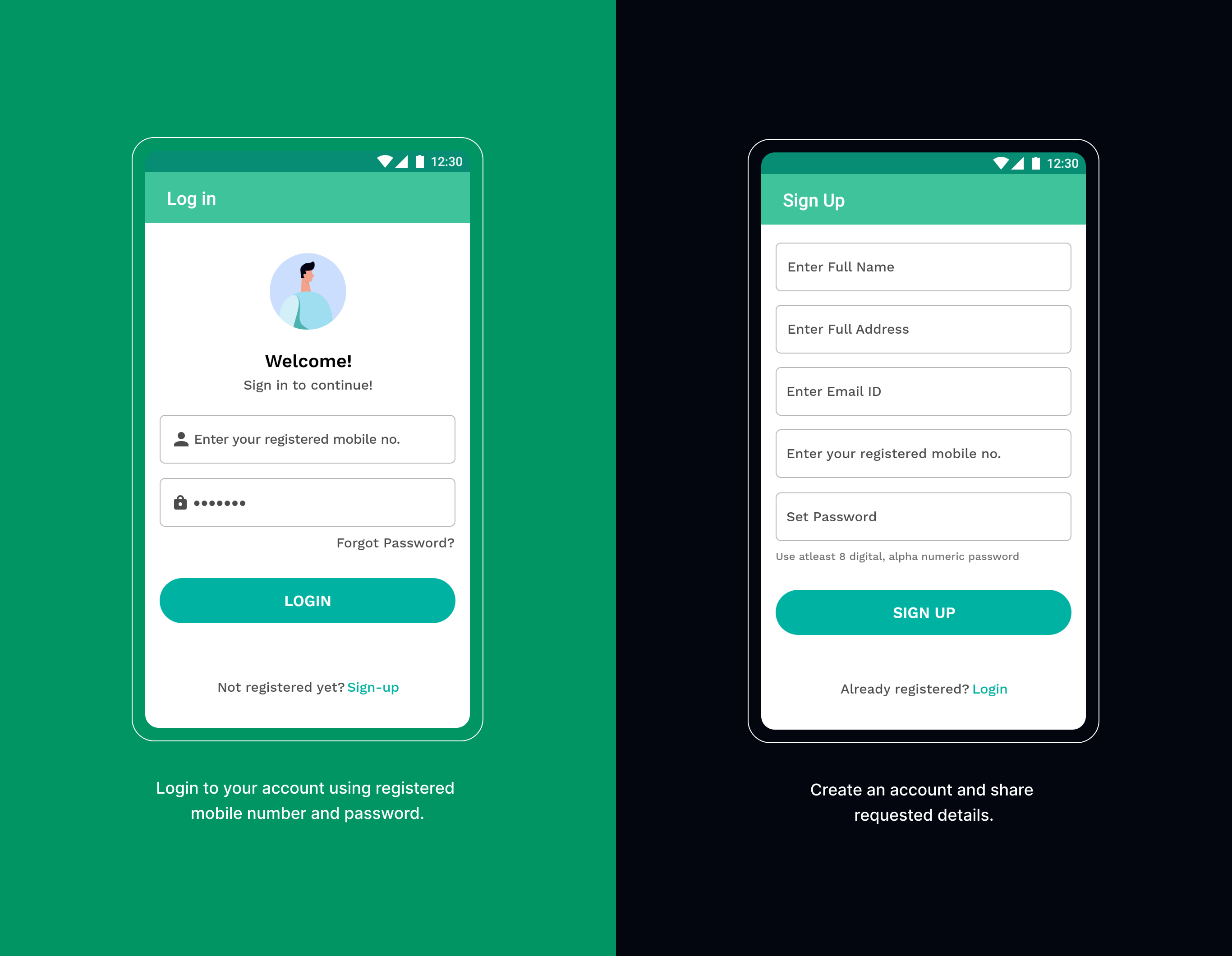
Registration Process
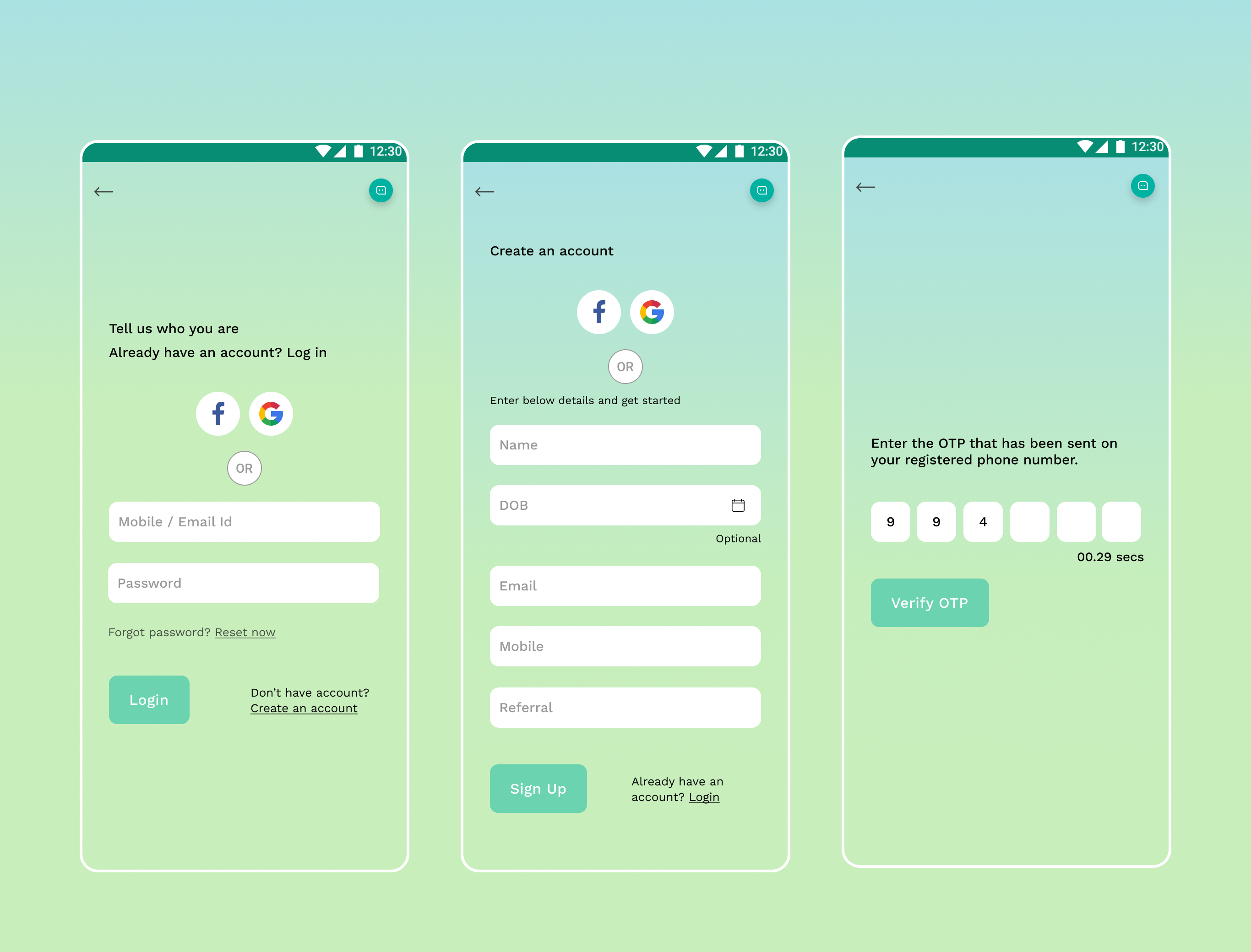
The steps after signing up are only shown once during user registration. This makes the frequently navigated routes after login straightforward and simple, aligning with our goals.
Iteration
From the user feedback, we swapped the positioning of icons to significantly improve the registration process. We utilized heuristic evaluation, a systematic approach, to assess and enhance product usability early in development.
Redesigned UI (Post user testing) : Simplifying the registration process by allowing users to sign-up using social media account or phone number can provide a more stream-lined and convenient user experience
Users can easily access to OTP number in order to complete the registration process
Bottom Navigation
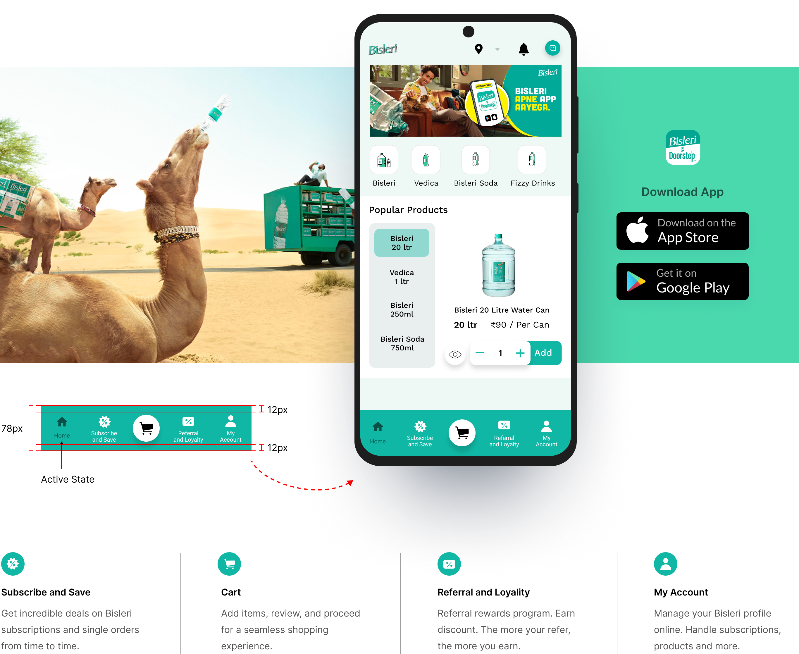
There are 5 destinations readily accessible through the bottom navigation bar. Bottom navigation bars typically feature icons paired with text labels to help users quickly and easily identify the different destinations available.
Prototypes
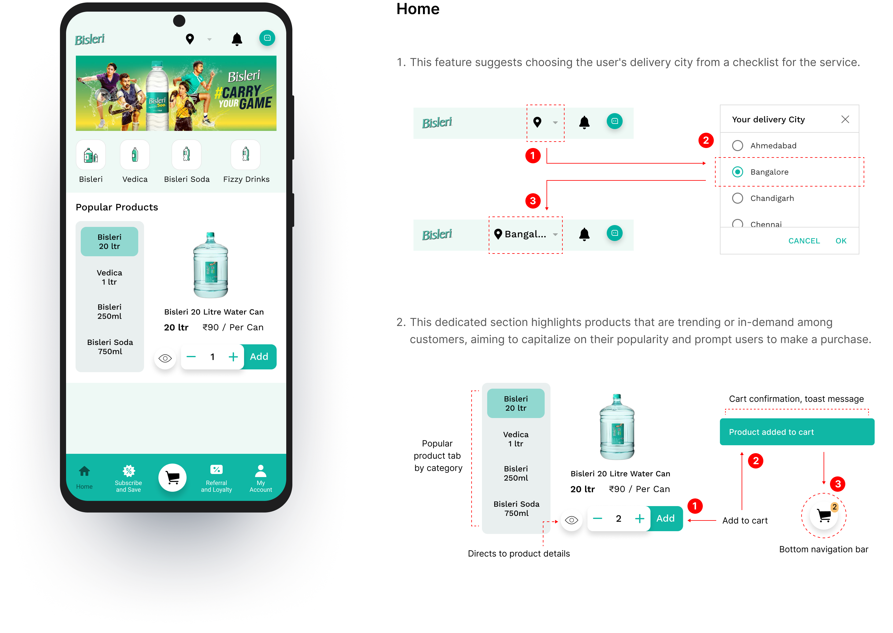
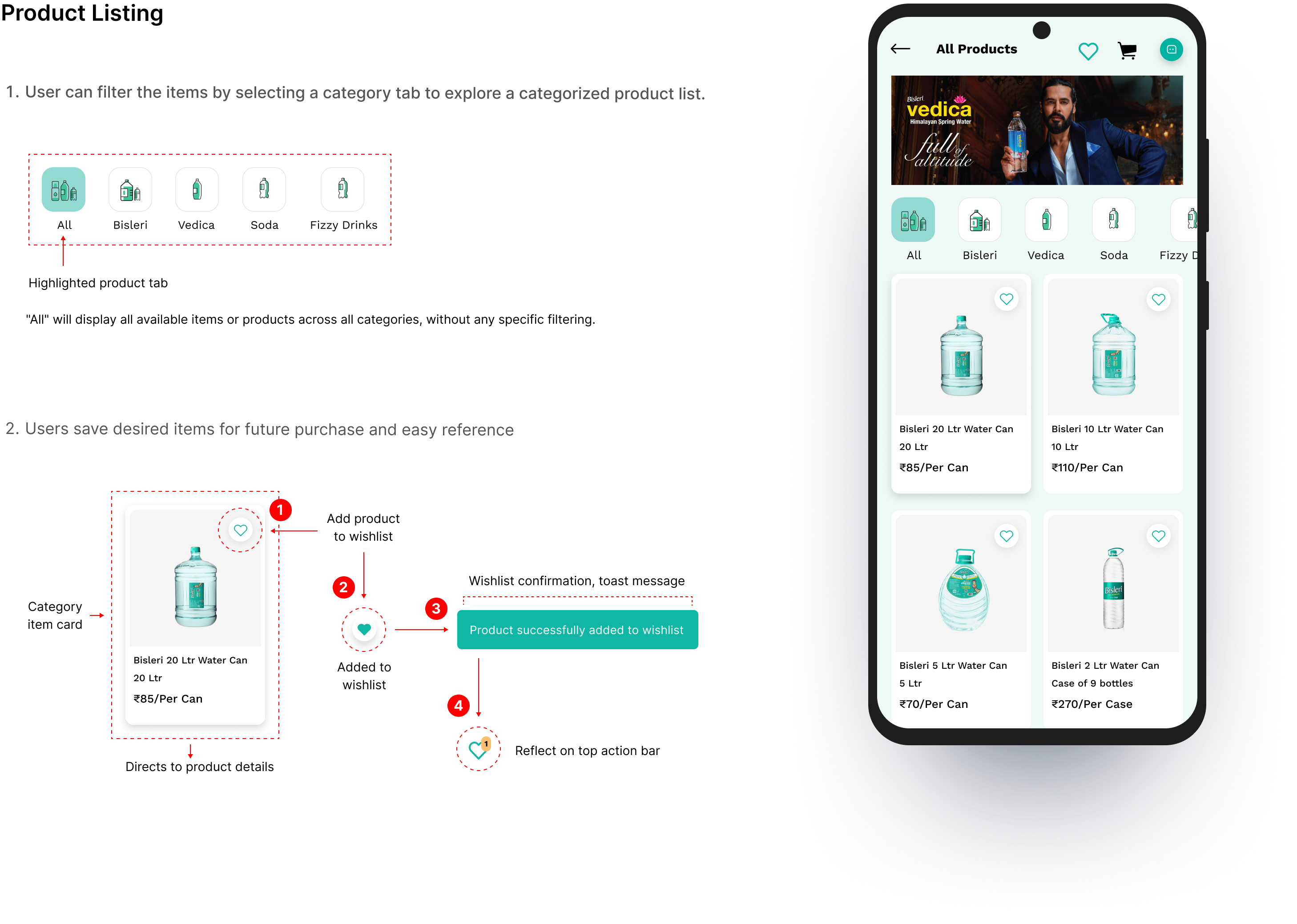
Integrating filter functionalities significantly assist users in efficiently providing a quick and precise search to scroll through a Bisleri’s diverse product list, solving the pain point of information overload and leading to faster discoveries, increased user satisfaction. Effortless quantity adjustment and a prominent "Add” to cart button creates a user-friendly shopping experience.
Product Detail
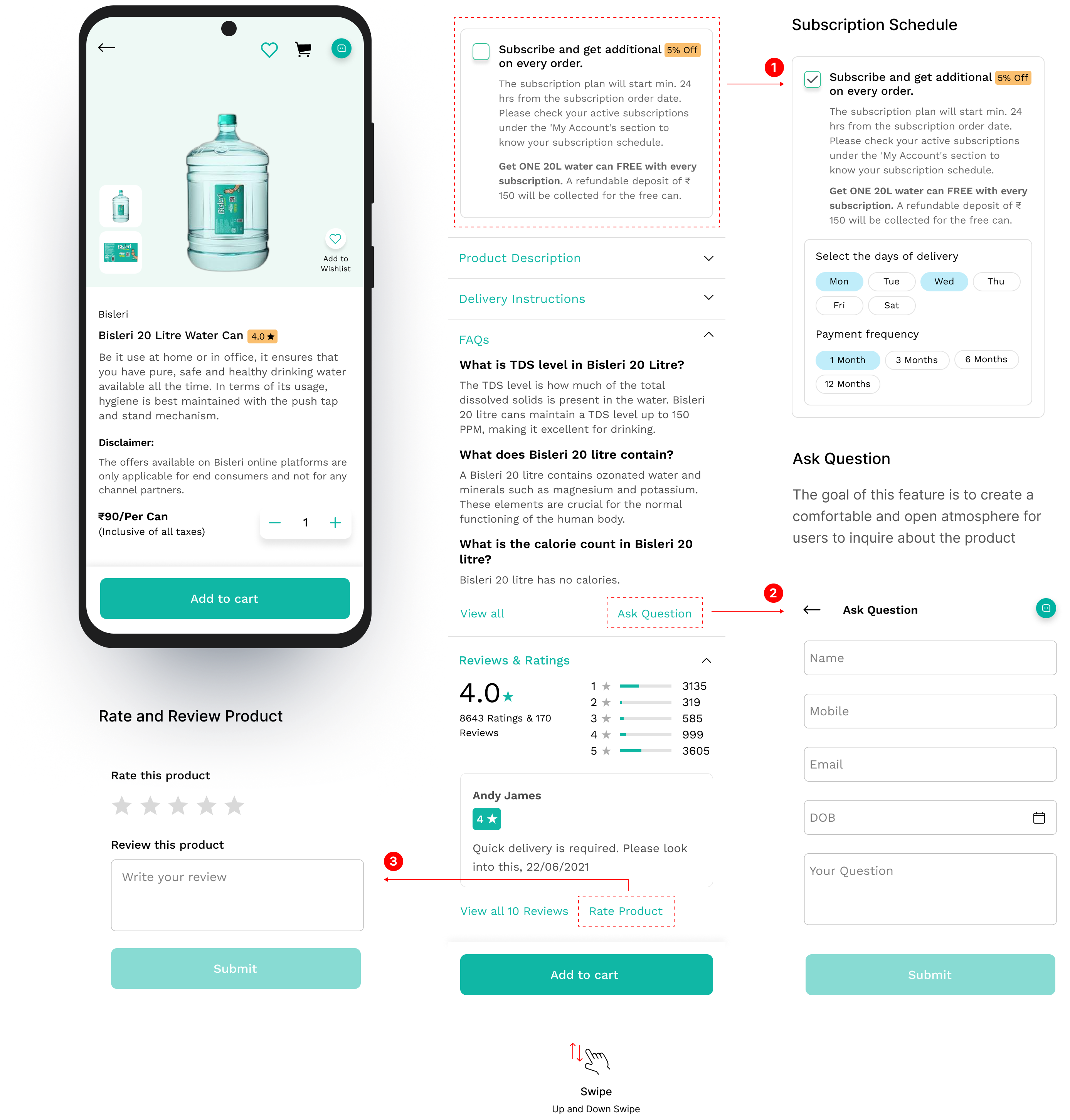
Our goal was to provide users with a comprehensive understanding of Bisleri’s product and service. It helps customers find everything they need to know about the offerings - Product Description, Delivery Instruction, FAQs, Review & ratings.
Checkout Process
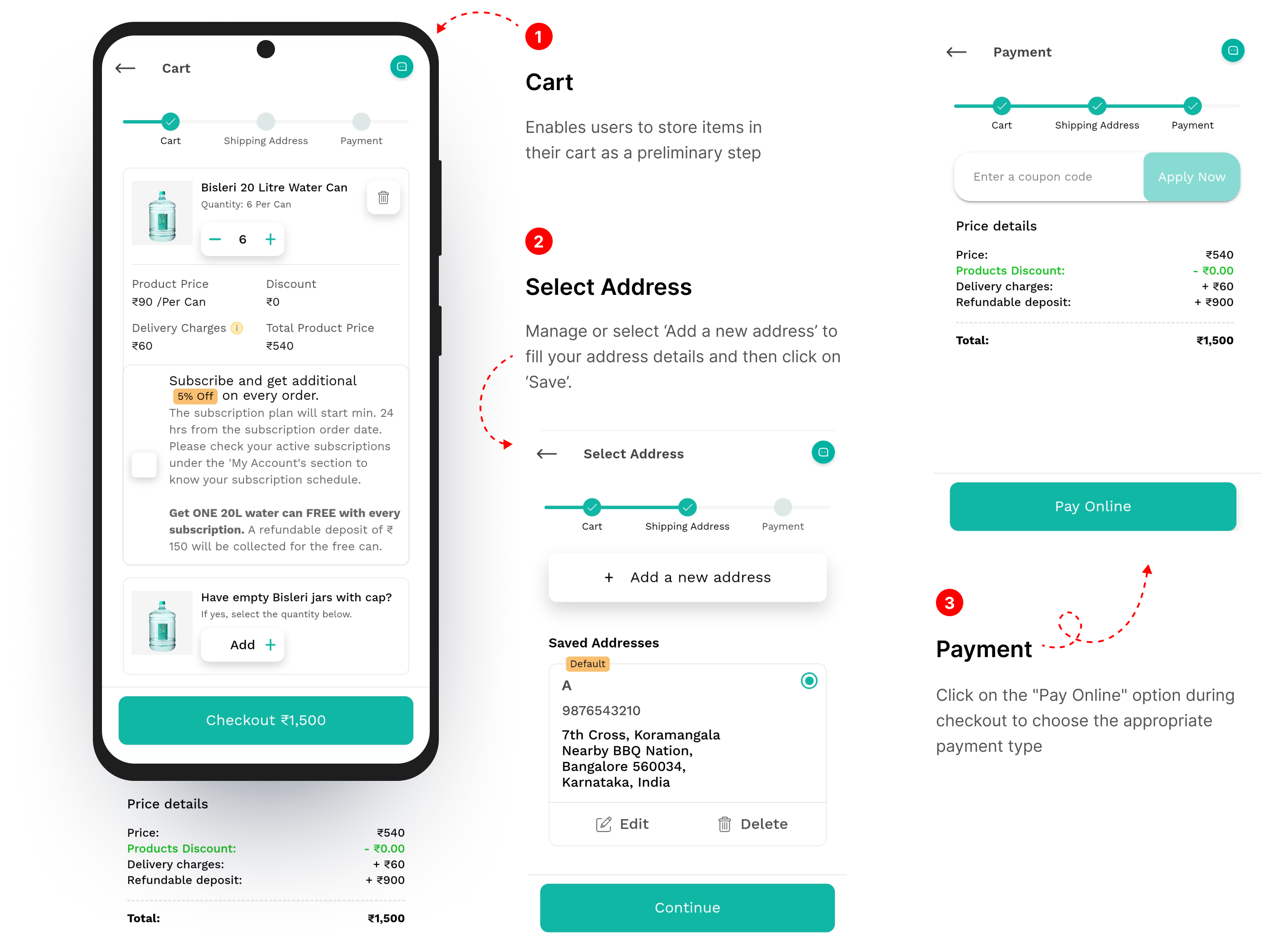
The 3 steps checkout presents distinct pages for customer information, shipping preferences, and payment methods.
My Account
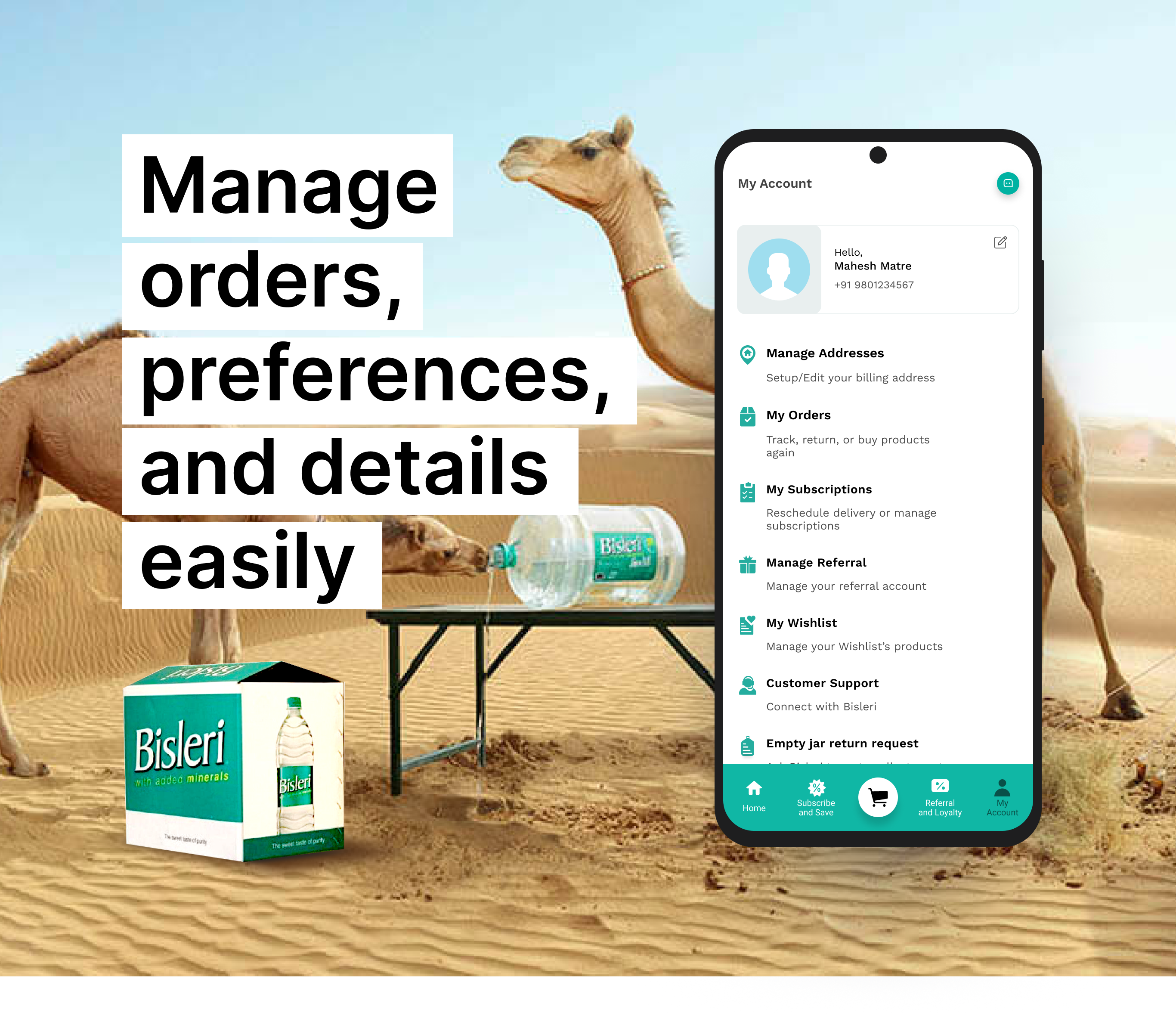
We transformed the "My Account" feature into a centralized hub, providing one-stop access to all account needs. Logged-in users can now seamlessly manage addresses, Orders, Subscriptions, Referrals, Wishlist, and seek help directly from the dashboard. Included eco-friendly options like jar return and pickup, appeals to users who care about the environment.
Outcome
Bisleri's new digital experience is now live, the launch saw positive reviews praising the app's aesthetic appeal and usability. A big thank you to all who made this project a success. I appreciated the opportunity to work with the team Design Head, PivotRoots. Her clear vision and guidance were invaluable to this project.


